Our latest UI update rebuilds the frontline employee experience around how people actually use their phones and desktops at work.
Why we rebuilt it
A frontline worker’s phone isn’t a desk. It’s checked on a break, between tasks, at the start of a shift. Sometimes with gloves. Often in bright sun. Rarely on a brand new device with fast Wi-Fi. When we looked at our app with that reality in mind, we realised the old version was good. But it had been designed to be good at everything. The new version is designed to be good at the moments that matter most.
What's changed on mobile
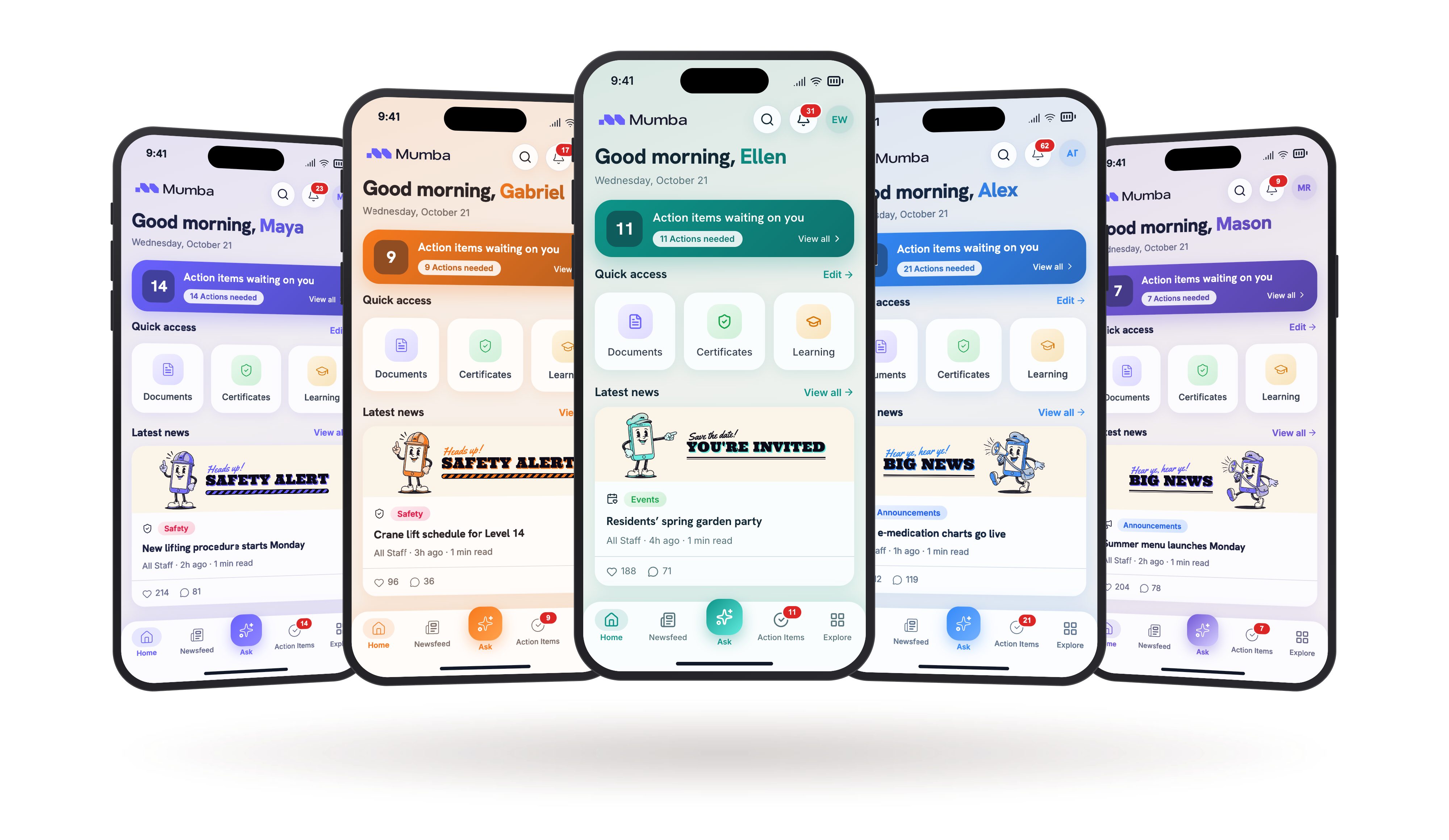
- A new home screen that brings today's actions, alerts and news into one view. No more hunting through menus to find what needs doing.
- Bigger, calmer type throughout. Easier to read in sunlight, at arm's length, in a hurry.
- A bottom navigation bar so the main parts of the app are always one thumb-tap away.
- A softer, warmer visual language. Rounder cards, gentler shadows, more breathing room.
- Touch feedback that reacts the instant you press. No lag, no spinners where they're not needed.
What's changed on desktop
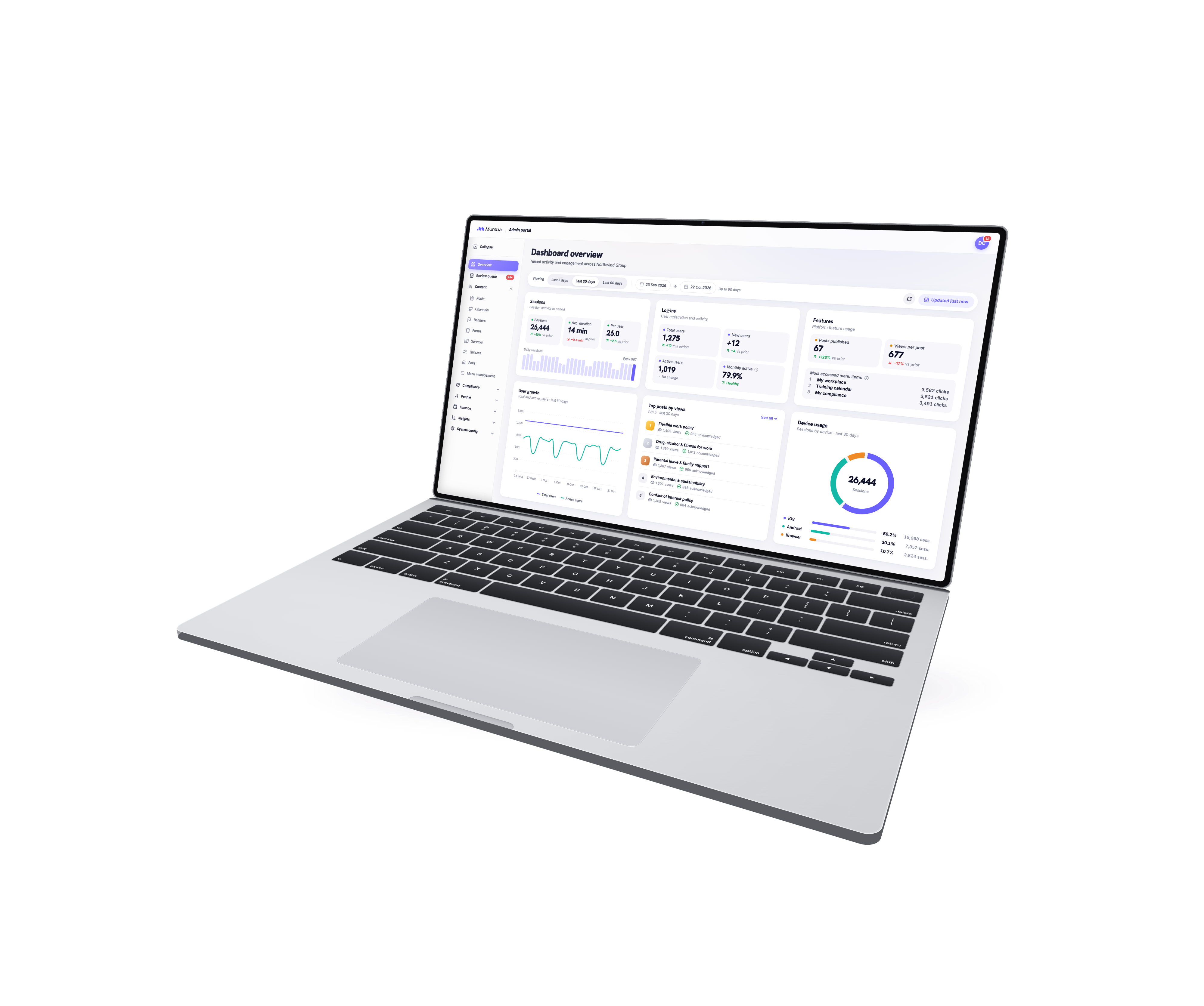
- A redesigned experience for the HR, comms and operations teams running Mumba every day.
- A new side navigation rail that stays out of the way until you need it.
- Global search to jump anywhere in the platform instantly.
- A content layout built for a desktop screen, not a stretched phone layout.
The principles behind the redesign
Four ideas guided every decision we made.
✦ Readable on a break
If a frontline worker can't read it in a hurry, in a glance, in the light they're actually standing in, it isn't finished.
✦ Big enough for a thumb in a glove
Every tap target is sized for a real workplace, not a design studio. Primary actions are large and easy to hit, even when hands are busy, cold or gloved.
✦ One thing at a time
Every screen has one job and one clear next step. If a screen is trying to do five things, nothing on it gets done well.
✦ Responds like it's native
The app reacts the moment you touch it. That's the difference between software that feels like a tool and software that feels like a chore.
Who shaped this release
This wasn't designed in a vacuum. It was shaped by:
- Customer workshops across industries, from aged care to logistics to retail
- Feedback from HR managers, comms leads and frontline workers using the app every day
- The full Mumba team (product, design, engineering, CX, sales, support) sitting down together to challenge every decision
The best product thinking at Mumba doesn't start with us. It starts with the people doing the work.
What's next
This is the first in a new series of Mumba Updates, where we'll share what we're shipping, who we're partnering with, and what we're learning from customers. If there's something you want to see improved, tell us. We're listening, and we're not slowing down.